 Design guide
Design guide
Design guide
When you need to compare two different types of data or data with significantly different value ranges, you can use the Dual Axis Chart in Ragic reports. By displaying two Y axes on the same chart, different metrics can be shown simultaneously, making it easier to analyze their relationship. For example, comparing total sales amount and order quantity, monthly sales and order volume, or revenue and cost trends.
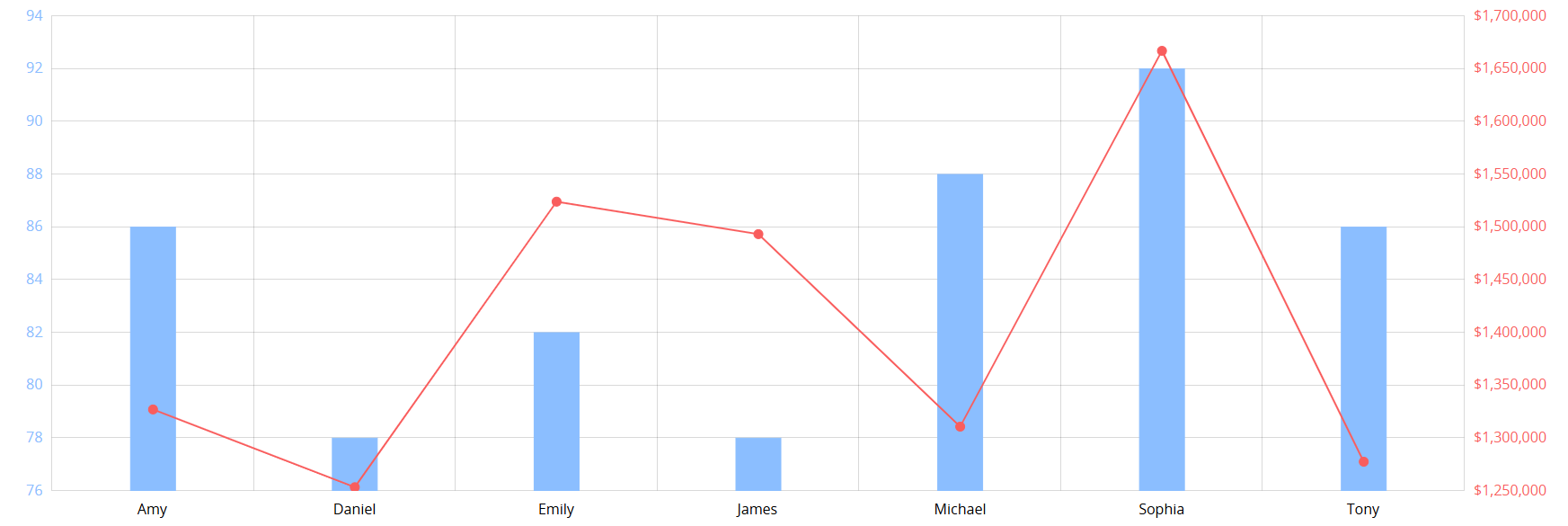
After creating the Dual Axis Chart report, the following page will appear.
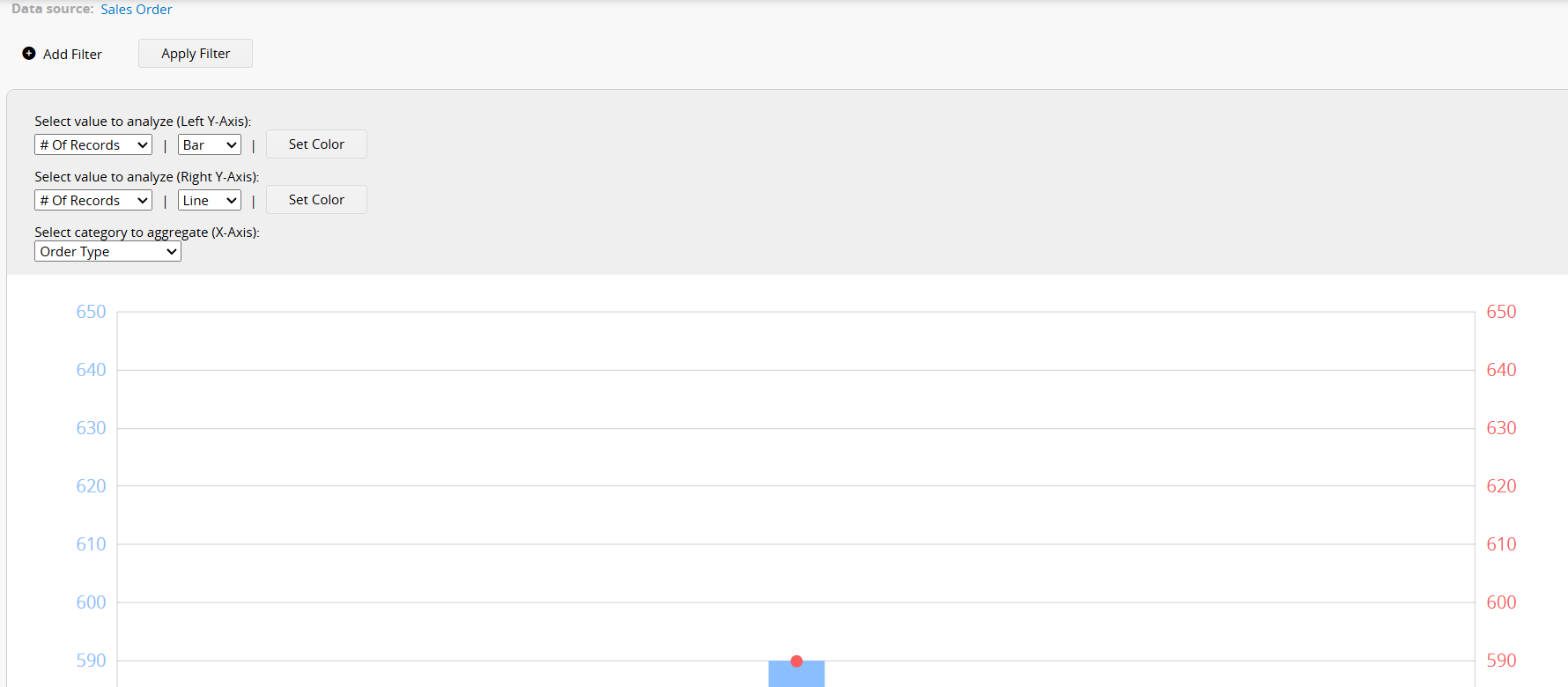
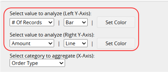
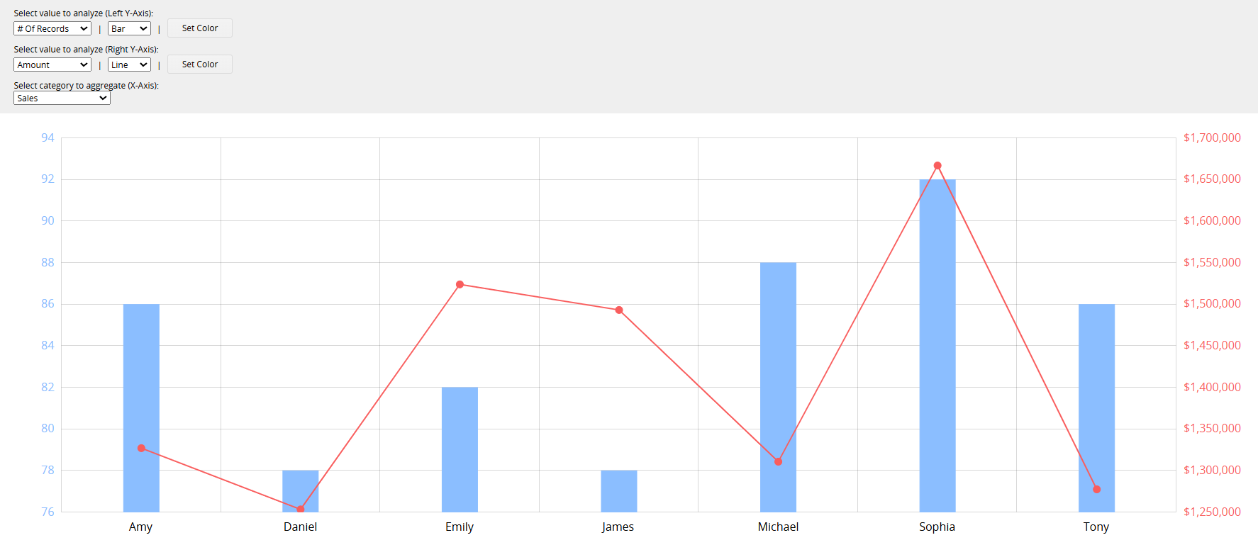
First, select the values to analyze for the left and right Y-Axes and choose whether to display them as a Line or Bar. You can also customize the colors.
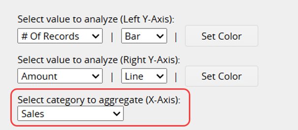
Next, select the field to aggregate on the X-Axis.
After completing the settings, the Dual Axis Chart report will be generated.
If you frequently use this type of report, you can save it for easy access later. Additionally, you can export the report as a PDF file or print it.
You can apply filters to generate the desired report.
You can embed the report into your website or share a link with others.
In the Report Settings, you can adjust the report's style settings, including font, font size, borders, etc., and the report's Filter and Access Rights.
Once a report is saved, you can use a Report Snapshot Schedule to automatically save a snapshot of the report at regular intervals, and view its state at different points in time in the Report Center.
You can create an Editable Report Snapshot to highlight data, apply styles to the report content (for example, bold, underline, or font color), or add tables and explanatory text.
 Thank you for your valuable feedback!