8 Pro-tips for creating beautiful looking database sheets with Ragic

Note (2025/05/27): We've launched even more features to help you design even a more beautiful Ragic sheet. For example: Sheet Theme and Sheet Sections. You can also refer to this document related to tuning your Ragic sheet.
-------
With my interactive graphic design background, I love how versatile Ragic is while designing database sheets. Here are some pro-tips to check out for beautiful looking forms.
1. Add your company logo
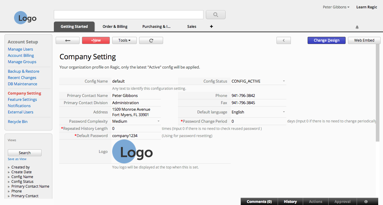
It's always a great idea to customize Ragic to fit your company's look & feel. If you are using Ragic's professional or on-premise plan, you can replace the Ragic logo in the top-left to your company's logo. (if you're using a different plan, check the next tip!)
Go to your Company Setting under your Account Setup. You can upload your company logo on this page so that it'll show up on every page.
2. Add images to your form design
Adding a header or footer on paper or on digital forms usually works great to establish your corporate identity. Same goes for banners and your logo. The design elements you add here will be displayed in the printer-friendly version as well.
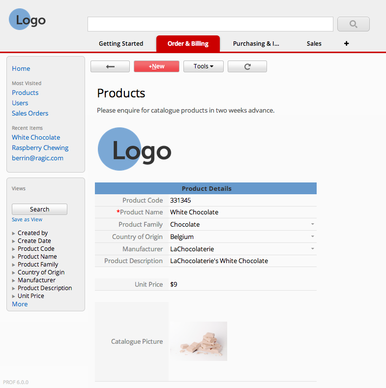
To add a default image that will always display on all your forms, simply add a static text field with an HTML image tag containing a link to your image. Learn how to do this by following the simple instructions here.
3. Mix and match your colors
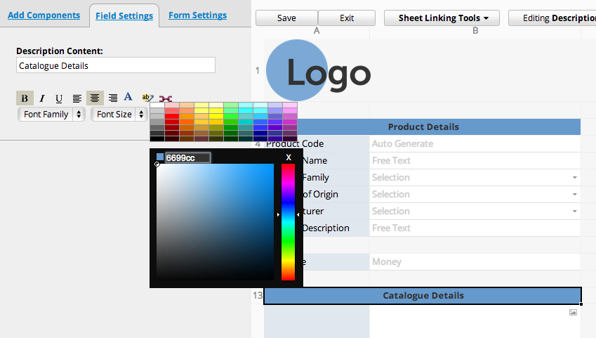
You can change the style of static text fields as well as the headers of regular fields to fit your company's corporate identity. Whether the colors you choose match your logo or your website's color scheme, editing the colors will add a sense of integrity to your overall design.
4. Make the columns fit just right.
Whether it's your listing page or form page, having overset text is pretty unseemly. To avoid this, you can drag the edges of the column header from the design mode to fit your field header, or the width of your field values.

Additionally, you can change the field header text from the design mode of your listing page. The changes made for what is displayed on the listing page will not reflect to the form page, and vice versa.
5. What about the rows?
If you'd like to keep everything on one line, you can have a field span multiple columns from the Basic tab while designing your form page.
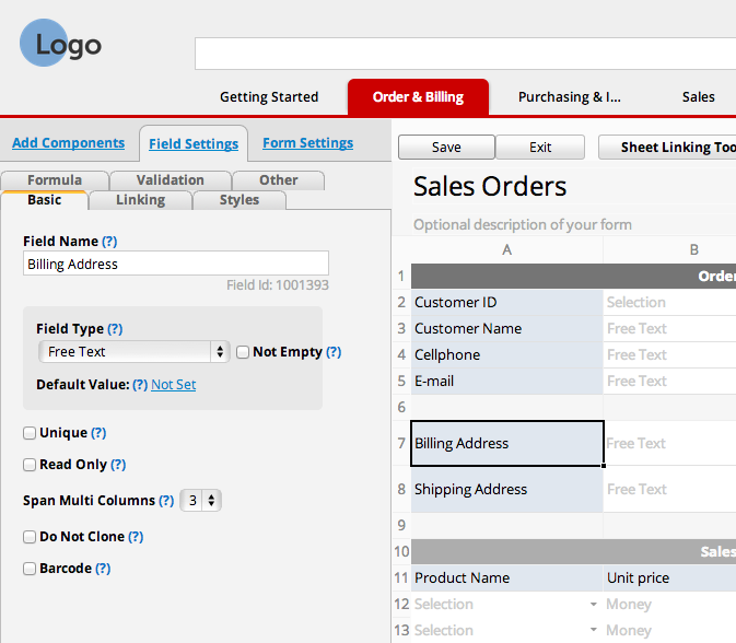
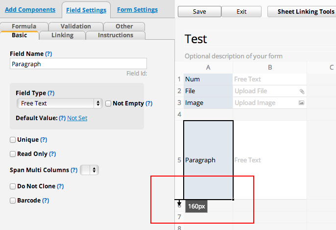
If you'd rather have a paragraph-like field that would expand as you enter more data, you can resize the height of the row, just like editing the width of the columns in the design mode.
6. Add some space
It's always a good idea to leave some white space for better readability, like how you'd leave a margin when composing a text document.
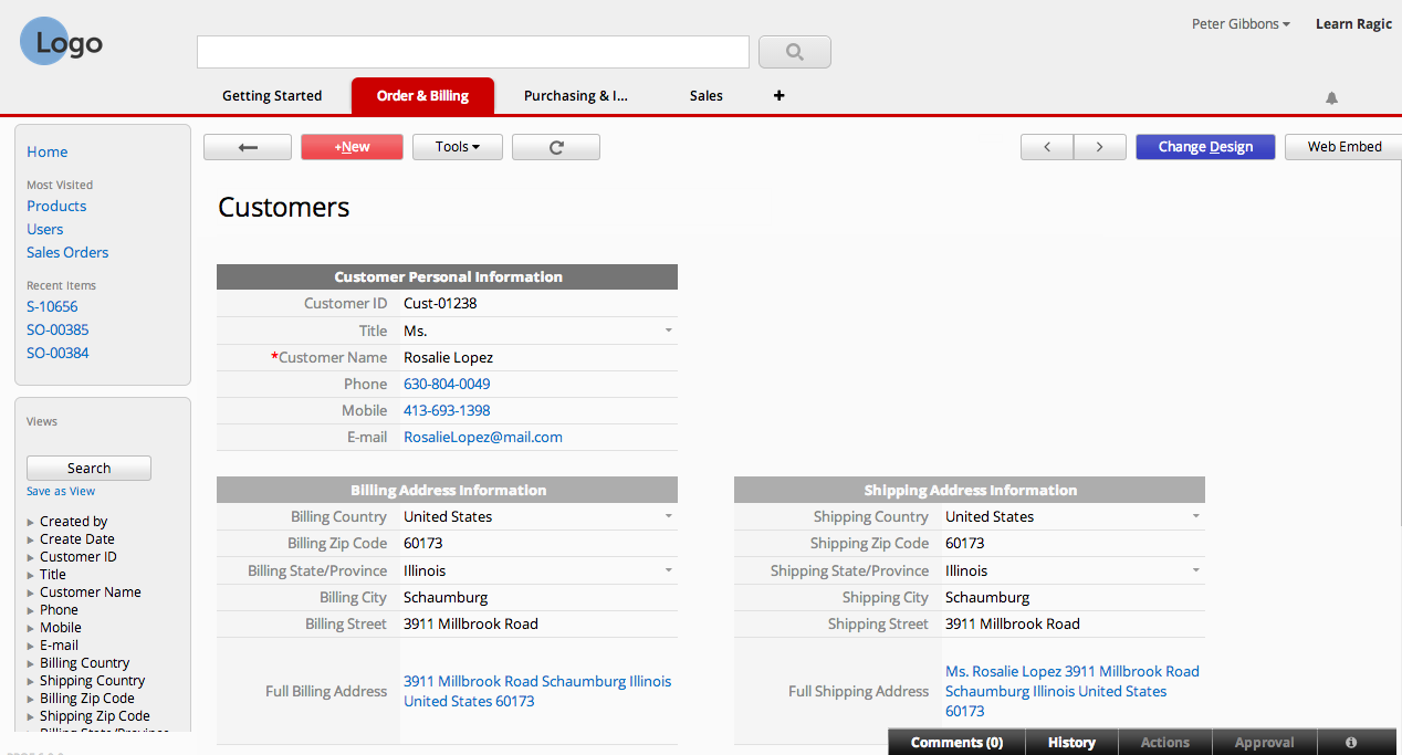
I've discovered that the best way for this in Ragic is to leave an occasional empty column (for me a 50-px width looks great) between fields in the same row in the form page.
7. Keep your listing page clean.
One of the best features that comes with using Ragic is the powerful search engine — you can search for values that aren't displayed on the listing page with any of the search tools.
You can also click on individual entries to go to the form page and view the details of each entry.
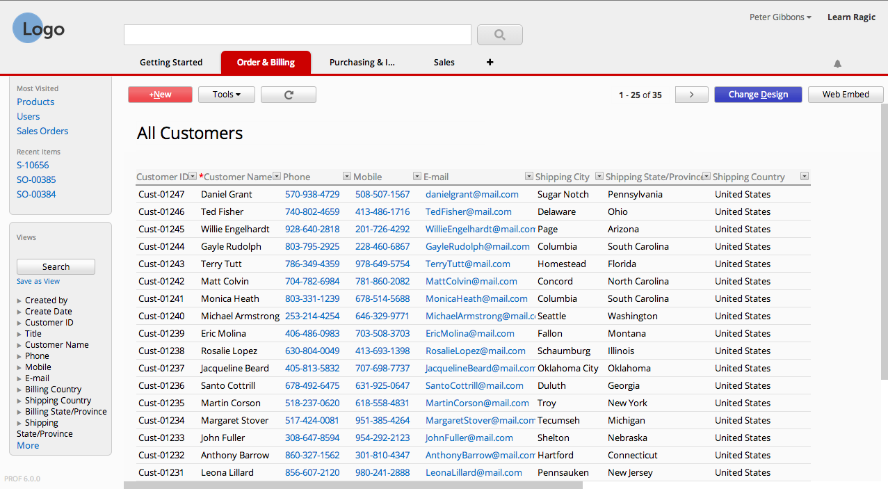
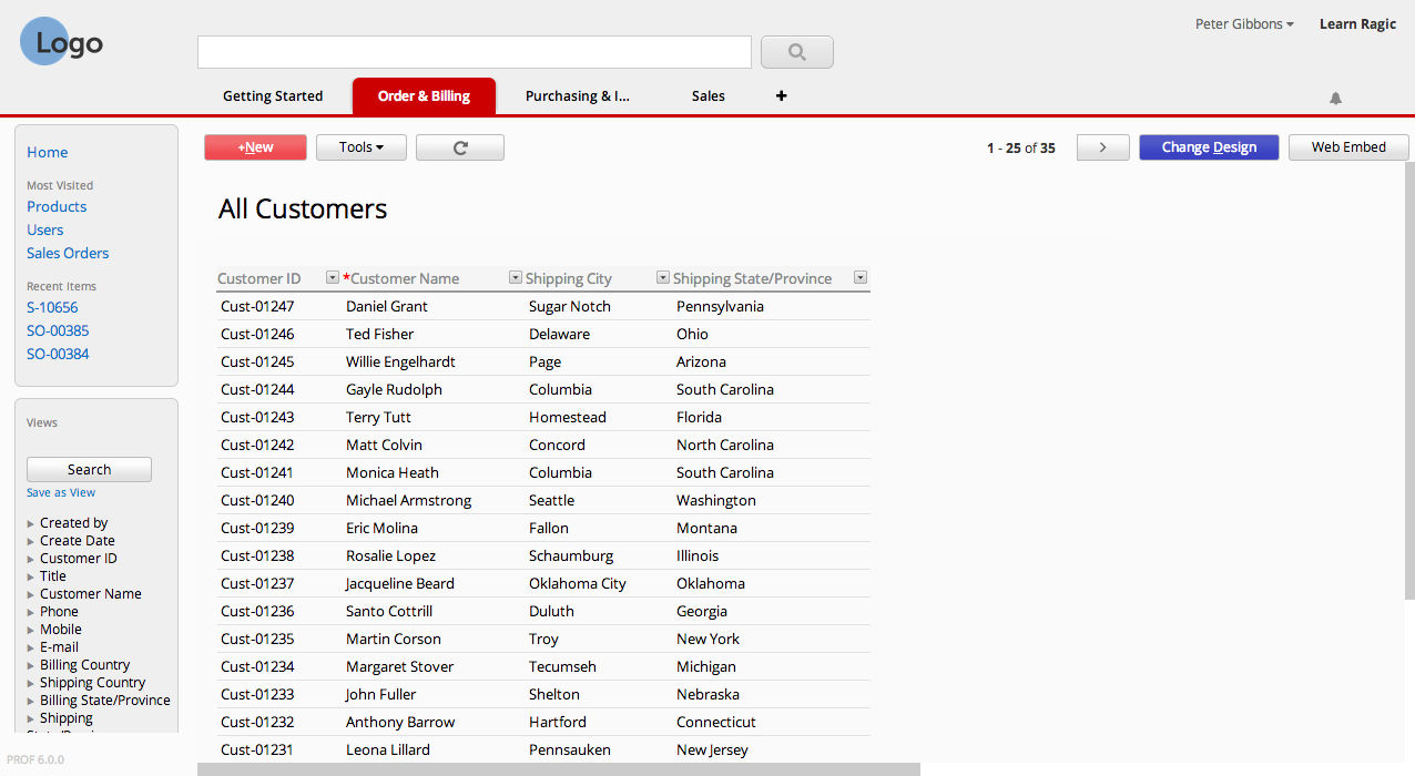
This means that you don't have to display most of the fields on your listing page, save the important data. You can choose which fields are displayed as columns in the listing page from the design mode.
before:
after:
8. Be consistent.
However you wish to design your forms, make sure that the design of your forms are consistent with each other to avoid confusion.
Did you find these tips useful, or have your own tip? Leave a comment!
Category: Talking Ragic > Learn Ragic


